State of Survival is a free-to-play post-apocalyptic management game in which you control a growing group of survivors in a world filled with the walking dead. While there are missions to complete and survivors to upgrade through intense battles, the main focus is building your base. Some build for efficiency, while others build for visual appeal. In this article, we’ve collected together the 15 best base designs in State of Survival from around the community to inspire you in your playthrough.
15. Mass Prosperity
This first base has been so well built that it’s prospering better than most we’ve ever managed to build. There’s no real secret here except playing the game the way the developer intended. Every building is constantly being upgraded, and the player requests build assistance from those in their Alliance to help bring those build times down. This requires a lot of dedication, logging in multiple times a day, and constantly working out which resources you need to build your next upgrade, but it’s very achievable.
14. Segmented
This one is for players who like to organize their buildings. Every building that produces a resource is in one area, intel is in another, and the single-use buildings are spaced out to avoid confusion. This base has been built so that the player knows exactly where to tape on the screen when they load it up. It’s highly efficient and has been designed this way from the start. Take note if you want to be able to quickly tap the screen once and claim everything in a rush.
13. Just for fun
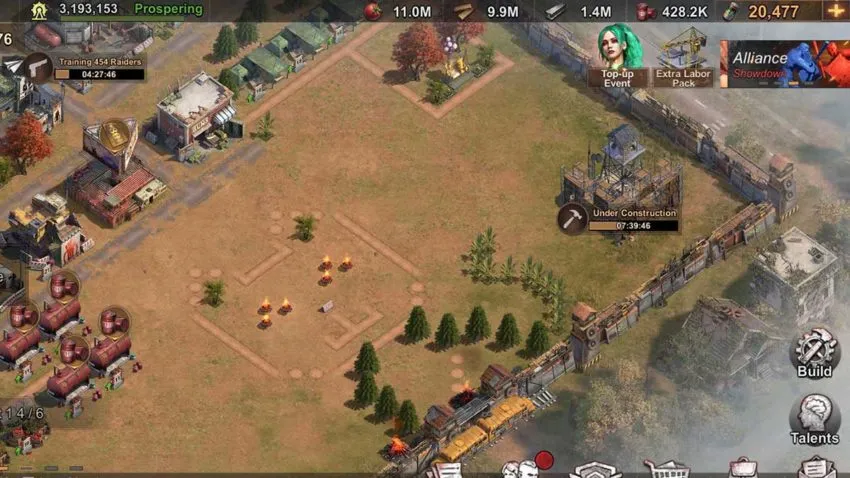
This base is a great example of a player messing around and having fun. You’re encouraged to build as many structures as possible and really fill out your base in this game. However, you can also have a bit of fun and draw out animal faces or other shapes on the ground. Nothing is stopping you from cramming your buildings together and maintaining a cute cat or dog for as long as possible.
12. A hopeful home
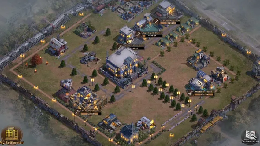
This base has been designed to look like a small, hopeful town in the middle of an apocalypse. It reminds us of Alexandria in The Walking Dead. An area in the world that’s safe and protected, where people can get back to some semblance of normality without worrying too much about the monsters roaming outside of the walls. This base definitely isn’t efficient, but it looks nice at least.
11. Hyper efficient
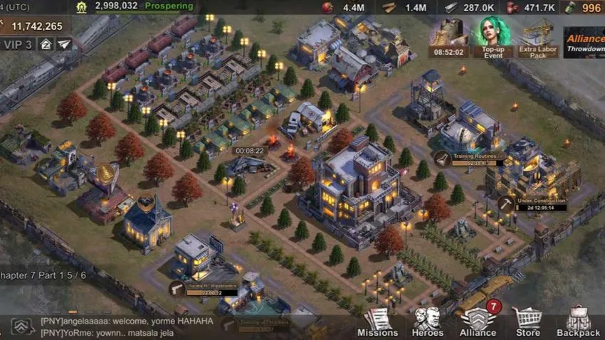
Here we see another base that’s been optimized for efficiency. It’s just different from the one above. While the last highly optimized base was all about having every resource in one location, this one gathers all specific building types together. It makes it easier to see how much production you have and other important structures dotted around the area.
10. Fabulous colors
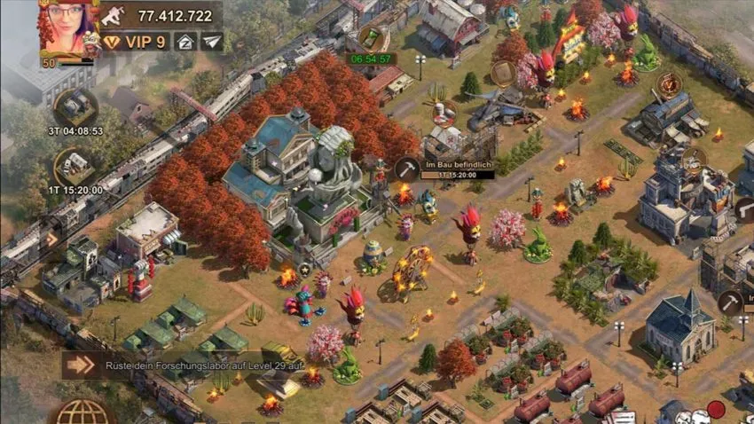
This base doubles down on the colorful aspects of this game. Usually, games set after the end of the world are drab and dreary. Here though, we can see colors bursting out of every corner. It’s a refreshing way to build a base and one that will make you stand out from the rest of the bases in your Alliance.
9. Division with paths
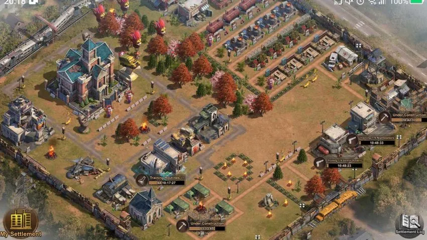
In this base, you can see how the player has used paths to define each area of their base clearly. This takes a lot of time and effort, but the result is arguably worth it. Like a few of the other bases in this list, this one looks like it could exist in real life. It’s natural for humans to try to create order wherever they are, and this base shows how that would work to the extreme in the world of State of Survival.
8. Celebration
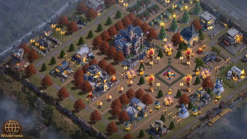
This base shows what happens when humanity thrives after the world has ended. Not only has this player put together a fantastic base, but they’ve also made it as bright as possible so that it flies in the face of the death that surrounds them. This is something to strive for if you’re starting and need some motivation.
7. Using the treeline
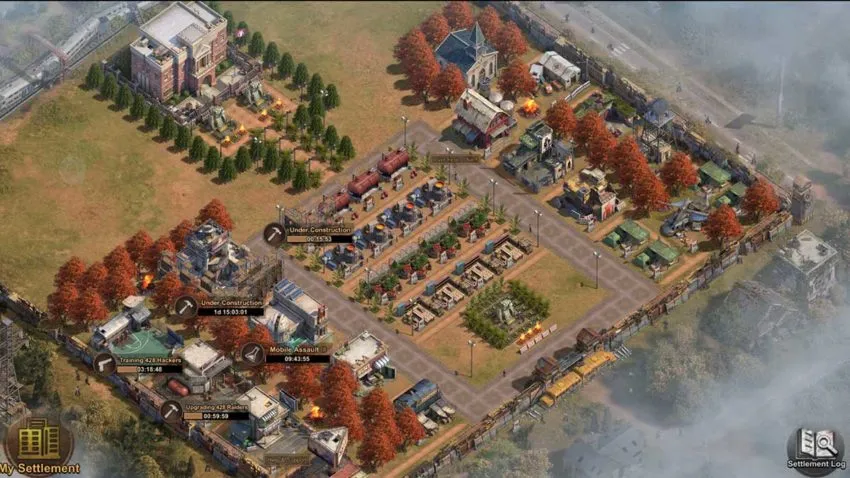
In this base, you can see how the player uses the treeline to disguise their buildings as much as possible. All of their production is in the middle, easily accessible with a single tap of the screen. The rest of the Settlement is off to the sides, safely tucked away behind the trees. It’s a nice way of aesthetically giving yourself an indication of where not to tap. Of course, once those production structures are fully upgraded, this base will be highly efficient.
6. Just a tap
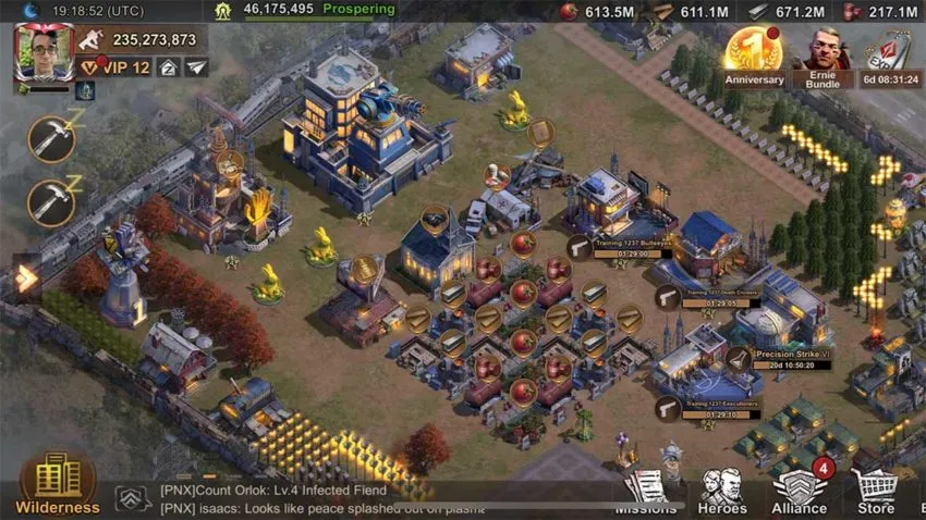
This base has been designed to award everything you need in a single swipe of the screen. That’s the dream for most players, allowing them to optimize their time in the game and spend as little time in their Settlement as possible. It looks extremely clinical, but if it works well, we can’t criticize it too much.
5. Cramped
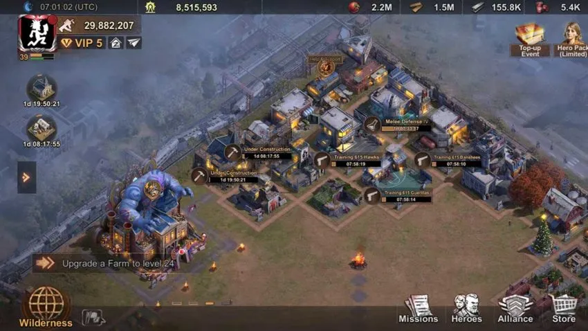
This base is what most players end up building in their first playthrough. Keeping all the buildings together in a single corner makes it easier to defend and keep track of what you’ve got. The only problem is that once you’ve reached a certain number of buildings, it’s pretty difficult to tell which structure is which. This also limits upgrades further down the line and isn’t a very smart plan to stick with for long.
4. Central park
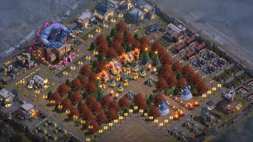
Most players ignore nature in their builds, but this base has it as a central focus. It’s nice to see but probably ends up getting in the way most of the time. If you’re looking for something slightly different to do in your next base, try out having a huge garden in the middle. If nothing else, it’s lovely to look at.
3. Chaotic
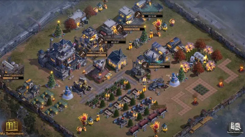
This base is what we all build on at least one playthrough. It’s the point in the game when we’re just smashing out the story without thinking about where we’re placing structures. It’s easy to rectify, but it’s hard to escape. The important thing to know is that everyone does it, and you shouldn’t feel bad for creating a bit of chaos. After all, the rest of the world is covered in rotting flesh.
2. Using lines
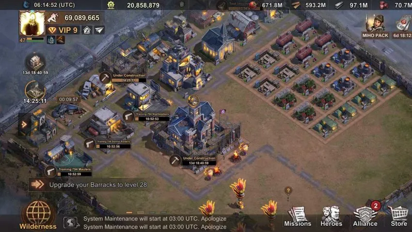
This base is all about the use of lines. Each building is based along a very deliberate line relative to the others around it. All the major buildings are in a huge block at the top, and the resource production is in a small rectangle off to the right. It’s probably quite efficient, but more than anything, it’s just organized. Perfect for those who enjoy order in their games.
1. One after the other
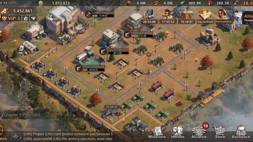
This final entry shows what happens if you space every building you need out one after the other. You end up with a base that has no personality whatsoever. There’s nothing wrong with that, and it’s fine if all you want to do is blast through the game without spending time on base design. If you’re looking to make something that looks good, though, avoid this.






Published: Jul 14, 2021 03:10 pm