Video game box art is an overlooked aspect of game marketing. The first thing we see of a video game is the cover art that represents what the game is supposed to be, enticing us to buy it. No other gaming franchise has had as great box art as Final Fantasy. The Final Fantasy series has some of the most beautiful aesthetics in the industry and is on display in every cover art for all the titles. The series is also known for hiring some of the best artists, including Yoshitaka Amano and Tetsuya Nomura, who lend their artistic talents to create several cover art.
Every Final Fantasy cover is a work of art and worth analyzing, but here are the 10 best in the entire franchise.
Related: Surprising no one, Final Fantasy XIV is Japan’s favorite Final Fantasy game
Best Final Fantasy boxart
10. Final Fantasy I
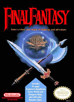
The original Final Fantasy box art released for North America is generic, only featuring a crystal ball with a sword and axe. Nonetheless, the art piece helped establish what the game is supposed to be and has become one of the iconic box art of the NES era.
9. Dissidia Final Fantasy
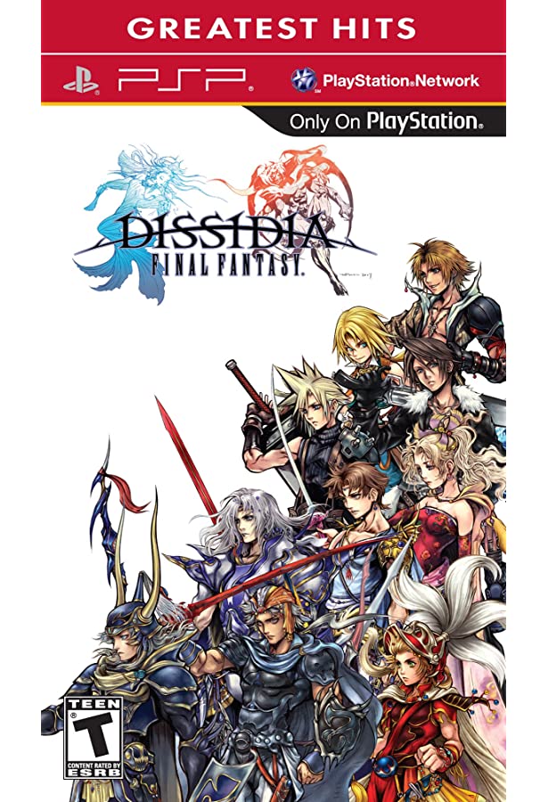
The original Dissidia Final Fantasy box art featured artwork of the main characters from the first 10 Final Fantasy games as drawn by Tetsuya Nomura. The fan service is more than enough to place this cover art on this list, as this was the first time that any of these characters were featured together in an official image by Square Enix.
8. Final Fantasy XV Deluxe Edition
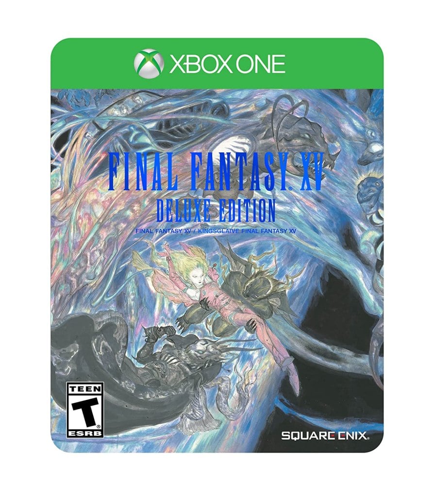
The Deluxe Edition for Final Fantasy XV features a mural drawn by Yoshitaka Amano. The mural is a little busy, but the blue coloring and elegantly drawn figures make the artwork look beautiful.
7. Final Fantasy III (Japanese)
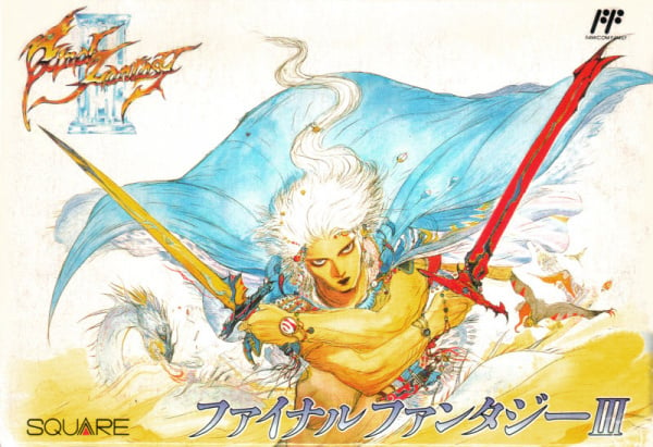
Yoshitaka Amano is an artist who worked as a character designer for the early Final Fantasy titles, with much of his concept art made into the game as box art. Amano is known for abstract images that blend western and eastern styles. Amano’s cover for Final Fantasy III is a dynamic art piece that stars an unnamed warrior with dual-wielding swords.
6. Final Fantasy I (Japanese)
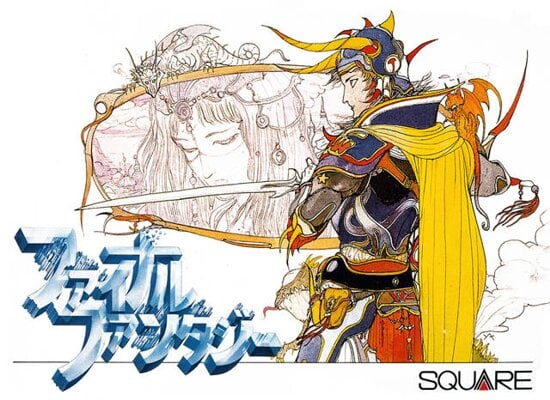
Amano’s artwork is known for its feathery line art and unusual coloring. It helped make the artist stand out in the industry and led to him getting hired to draw designs for the original Final Fantasy game. His original concept art for the Warrior of Light made it to the cover of the original Final Fantasy game and has become an iconic image within the franchise’s history.
5. Final Fantasy II (Japanese)
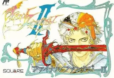
Of the original Final Fantasy trilogy box art, the Japanese cover for Final Fantasy II is the most striking. The artwork is simple yet evocative, showing the game’s protagonist, Firion, holding up his sword. It’s an eye-catching image that has since been homaged several times in the RPG community.
4. Final Fantasy XIV Stormblood Collector’s Edition
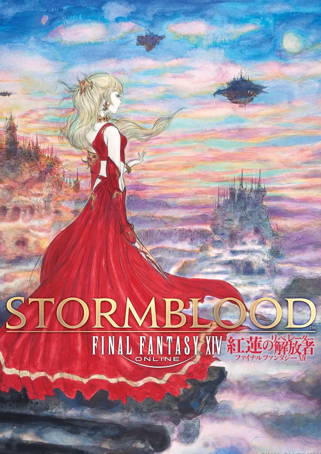
Amano and his studio continued to provide artwork for the Final Fantasy series long after Amano had stopped working on the games as the character designer. One of the most beautiful promotional artworks Amano and the team made was for Final Fantasy XIV, one art piece featuring a woman in a long red dress overlooking the wonderful world of XIV. The red in the artwork is lavish, and the promo art was used as the cover for the Stormblood Collector’s Edition box set.
3. Final Fantasy XII The Zodiac Age
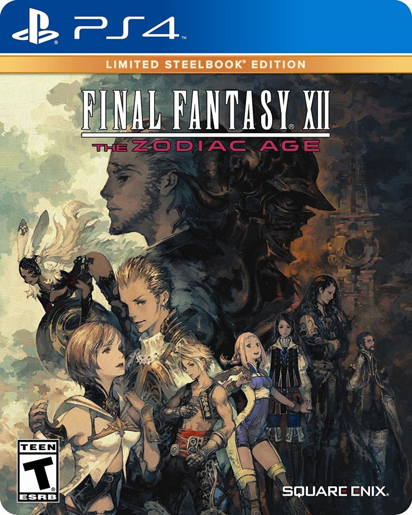
Akihiko Yoshida was the character designer for several Final Fantasy titles in the 2000s, including Final Fantasy XII. Yoshida is known for his soft, round face and highly detailed backgrounds and clothing. When XII got remastered, Yoshida did the box art, creating a striking image that successfully uses contrasting bright and dark colors to exemplify good and evil.
2. Final Fantasy VII
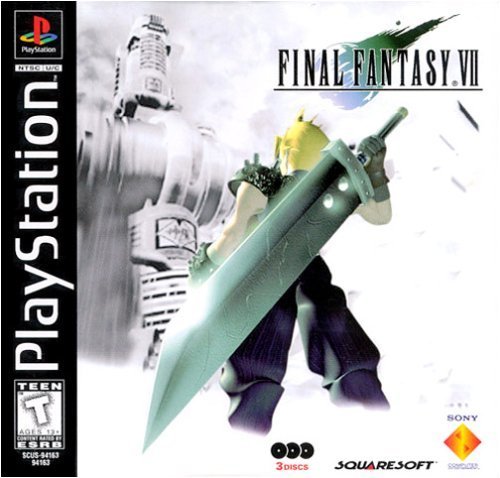
Whereas the Japanese cover for Final Fantasy VII was a blank white cover with only the logo, the North American box art used one of the promotional images for VII. The promotional images used CGI character models and backgrounds rather than commissioned artwork. Cloud Strife standing in front of the Shinra Corporation is one of the most recognizable game covers in history, proving that North America made the right decision.
1. Final Fantasy VI (Japanese)
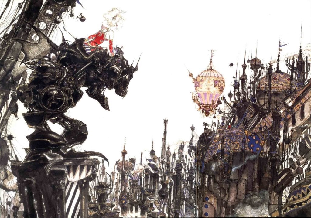
The Japanese cover for Final Fantasy VI is Yoshitaka Amano’s magnum opus, successfully combining the series’ trademark mixture of fantasy and techno-futurism. Nothing in the image is like anything that we’ve ever seen before, including the beautiful woman in the red dress. The city, the giant robot, the woman, and even the blimps look alien and unnatural, yet our brains recognize them as what they are supposed to be. The heavy, black inks used for the mecha and city give off a sinister atmosphere, while the red in Terra’s dress makes her stand out as a symbol of elegance and hope. There has never been a better Final Fantasy cover since VI.


Published: Dec 20, 2022 08:58 am